Chapter 6: Cumulative Layout Shift (CLS)
Essentially, Cumulative Layout Shift (CLS) measures the visual stability of a page during its lifespan.
Technically, CLS measures the largest burst of layout shift scores for every unexpected layout shift that accumulates over a specific window of time during the entire lifespan of a page.
So, it gets a little complicated. Let’s try to dissect each term in cursive in the CLS definition.
A window of time, or session window, groups layout shifts together. A session window starts with the first layout shift and continues until there is a 1-second gap with no layout shifts. When the next layout shift occurs, a new session window starts, and so on. Additionally, each session window is capped at 5 seconds.
The image below shows a visual representation of three window sessions on a given page.
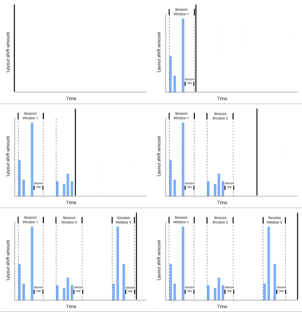
Each blue bar represents a layout shift score in the image above, another important aspect of the CLS definition. We won’t get into the details of how a layout shift score is calculated since Google already provided a fantastic explanation (you should check it out!).
Going back to the image above, you need to know that the largest burst is the session window with the maximum cumulative score of all layout shifts within that window. That’s what CLS measures!
Now, before getting into debugging and optimizing CLS, you must first understand yet another key concept: unexpected layout shift.
An unexpected layout shift occurs when a visible element changes its start position from one rendered frame to another.
Please note the keyword unexpected. That’s because not all layout shifts are bad. Shifts that users can reasonably expect are not necessarily an issue. Examples are layout shifts in response to user interactions (button click, typing, etc.) and gradual and natural animations and transitions.
Additionally, we need to stress that layout shifts occur when a visible element changes its start position. Thus, a new element added to the DOM or an existing element resized won’t count as a layout shift, provided that those disruptions won’t change the start position of other visible elements.
For example, the image below shows a “Click Me!” button appended to the bottom of the gray box with black text, which pushes the green box with white text down.
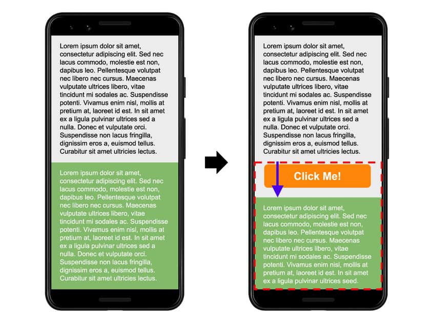
Source: Google.
In this case, the gray box changes size, but it is not a layout shift because the resizing does not change the start position of the gray box. However, it can cause a layout shift because it contributes to changing the start position of the green box.
Additionally, the “Click Me!” button was not previously in the DOM, so its start position doesn’t change either. Therefore, the mere appearance of the button is not a layout shift, but it can contribute to the layout shift experienced by the green box.
The most common causes of layout shifts are:
- Changes to the dimensions of a DOM element that change the start position of another visible element.
- Insertion or removal of a DOM element that changes the start position of another visible element.
- Animations that trigger layout.
Examples of unexpected layout shifts are:
- Cookie notices pushing content within the viewport down.
- Images or videos that cause re-layout after loading.
- A font that renders larger or smaller than its fallback.
- A third-party ad or widget that dynamically resizes itself and moves the surrounding elements.
Measuring CLS
Google considers that your page provides a good user experience when its CLS score is 0.1 or less. Thus, you should strive to make the 75th percentile of your page views meet the Good threshold.

Source: Google.
You can measure and debug CLS in the field with any of the following tools:
- Chrome User Experience Report
- PageSpeed Insights
- Core Web Vitals report in Google Search Console
- web-vitals JavaScript library
- Layout Instability API
- Experimental Chrome Performance HUD
However, most of the time, debugging CLS issues will require you to get your hands dirty with Lab Data. Some tools will help you debug CLS issues, especially those that happen within the viewport:
- Chrome DevTools. Check out a fantastic guide by Upbuild on finding and fixing layout shifts using Chrome DevTools.
- Lighthouse
- PageSpeed Insights
- WebPageTest
- CLS Checker by Journey Further
- Layout Shift GIF Generator
- Cumulative Layout Shift Debugger
Lab and Field Data considerations
One important limitation of measuring CLS in the lab is that synthetic tools will only measure and display layout shifts within the viewport and during page load. However, CLS in the field will also capture layout shifts produced during the lifespan of the page.
Layout shifts that lab tools might capture include:
- Images or iframes below the fold without specific dimensions that cause layout shifts.
- Personalized content inserted later into the main content, causing layout shifts. Examples of personalized content are A/B tests, ads, and cookie banners.
Additionally, lab tools won’t include the effects of cached resources. Thus, slow loading images and web fonts may have a greater impact on CLS in the lab.
As a result, lab CLS values may end up completely different than what actual users experience. This makes troubleshooting CLS in the lab challenging but not impossible.
Improving CLS
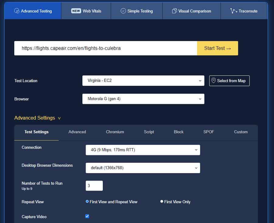
The tool that we see more useful to debug layout shifts is WebPageTest. You can read everything about using WebPageTest to dive into CLS issues on this blog post, but basically, you want to follow the below steps.
- Head to WebPageTest and configure the test:
- Enter affected URL
- Change Test Location to the airline’s most popular location
- Change Browser to Motorola G (gen 4)
- Under Test Settings, set Connection to 4G
- Leave everything else as default
If you want to learn more about test configuration in WebPageTest, follow Matt Hobbs’ guide to running a WebPageTest test.
2. Inject JS to simulate scrolling. In Advanced, under Inject Script, use the JS snippet provided by WebPage Test on its blog post to scroll through the page.
window.addEventListener("load", async function () {
    function sleep(ms) {
        return new Promise(resolve => setTimeout(resolve, ms));
    }
    let pages = document.body.scrollHeight / window.innerHeight;
    for(let page = 0; page < pages; page++) {
        window.scrollBy(0, window.innerHeight);
        await sleep(200);
    }
})- Run the test and sit tight.
- On the Test Result page, you will find overwhelming information about the performance test, including metrics, all sorts of assessments, waterfalls, links to further resources, etc. But in this case, you only need to focus on CLS results. Therefore, just click on Cumulative Layout Shift under Web Vitals.

- On the next screen, you will see a series of “windows” where layout shifts occur. You can hover over each window to see shifts happening!
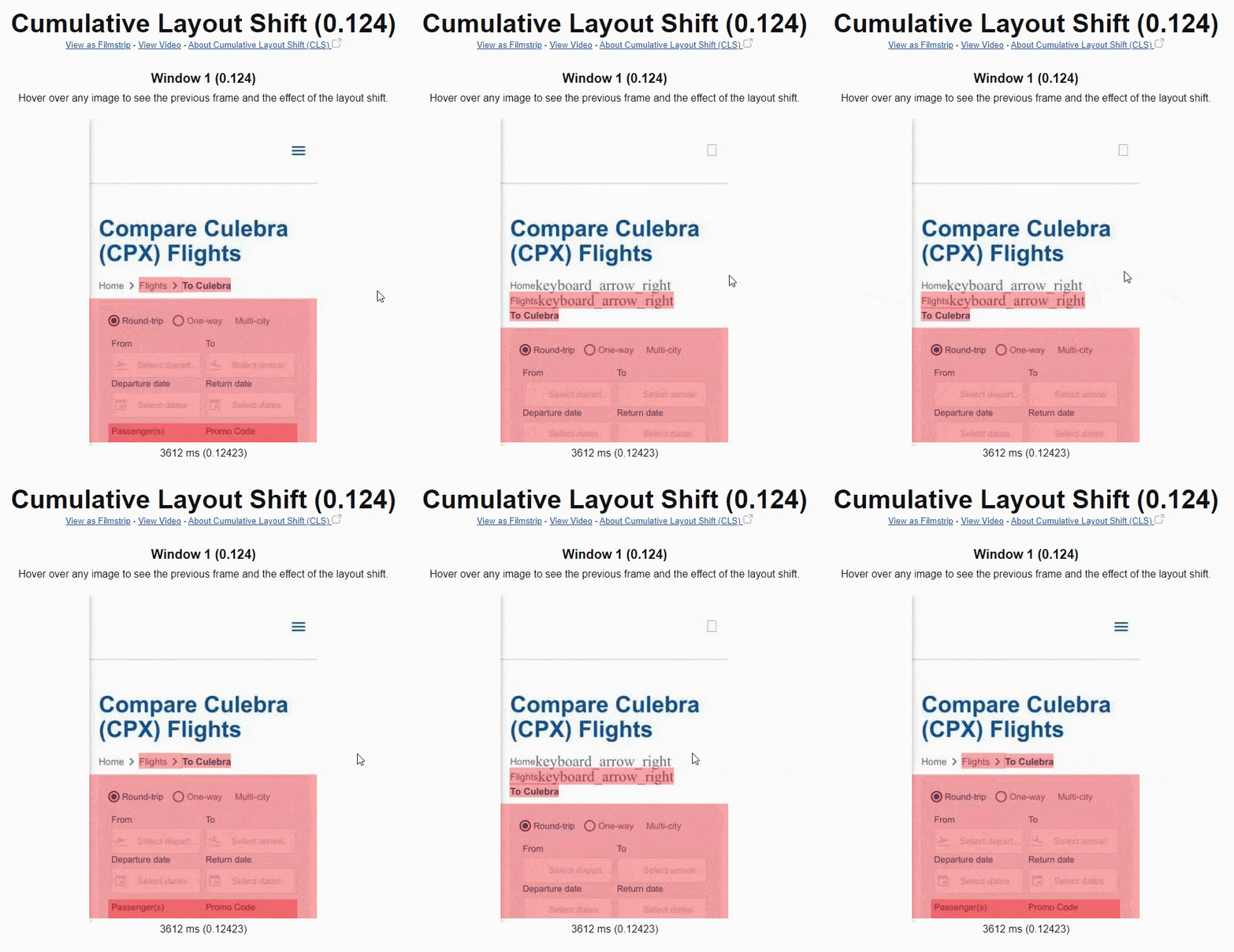
In general, the DOM element immediately preceding the shifted element is the most likely cause of layout shift, but always ask the following questions as guidance:
- Did the position or dimensions of the preceding element change?
- Was a DOM element inserted or removed before the shifted element?
- Was the position of the shifted element explicitly changed?
If the preceding element was not the cause of the layout shift, continue looking at other preceding elements.
Your goal shouldn’t be to correct every layout shift you detect but to fix the largest contributors to your page’s CLS at the 75th percentile.
The most common behaviors that cause layout shifts are summarized in the below table.
Changes to the position of an element that aren't due to the movement of another element.
1. Stylesheets that are loaded late or overwrite previously declared styles.
2. Animation and transition effects.
Changes to the position of an element that aren't due to the movement of another element.
1. Stylesheets that are loaded late or overwrite previously declared styles.
2. Images and iframes without width and height attributes that load after their "slot" has been rendered.
3. Text blocks without width or height attributes that swap fonts after the text has been rendered.
The insertion or removal of DOM elements.
1. Insertion of ads and other third-party embeds.
2. Insertion of banners, alerts, and modals.
3. Infinite scroll and other UX patterns that load additional content above existing content.
Source: Google
Google put together a guide to optimizing CLS, which we summarized below using specific examples from airlines’ websites. Other in-depth resources cover more optimization opportunities, like this one from Smashing Magazine.
Add width and height size attributes on images and videos
Always include width and height size attributes on images and videos. This will prevent layout shifts while images and videos are loading. For more details on this, check out this implementation walkthrough.
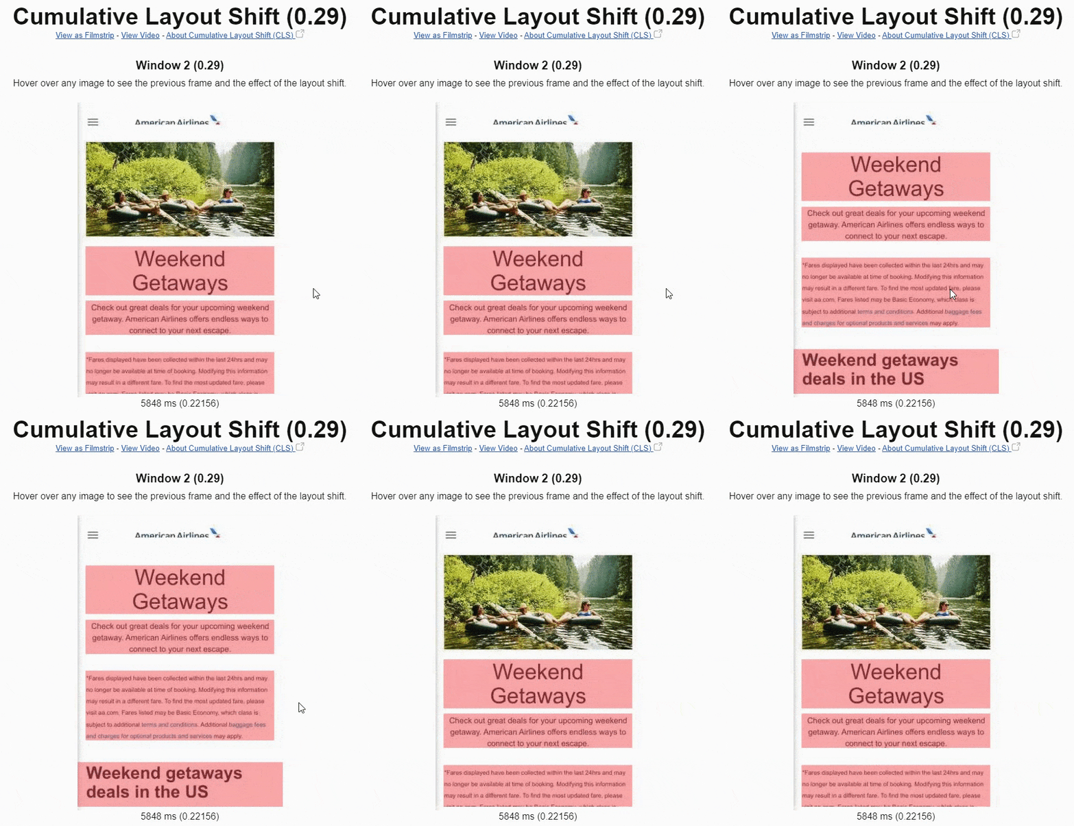
Alternatively, you can leverage the CSS aspect ratio boxes to allow the browser to allocate the space needed for the image. Including the width and height attributes and setting the aspect ratio using CSS will make the browser get the image dimensions before rendering the page.
For responsive images, you can use the srcset attribute to indicate the images you want the browser to select and what size each image is.
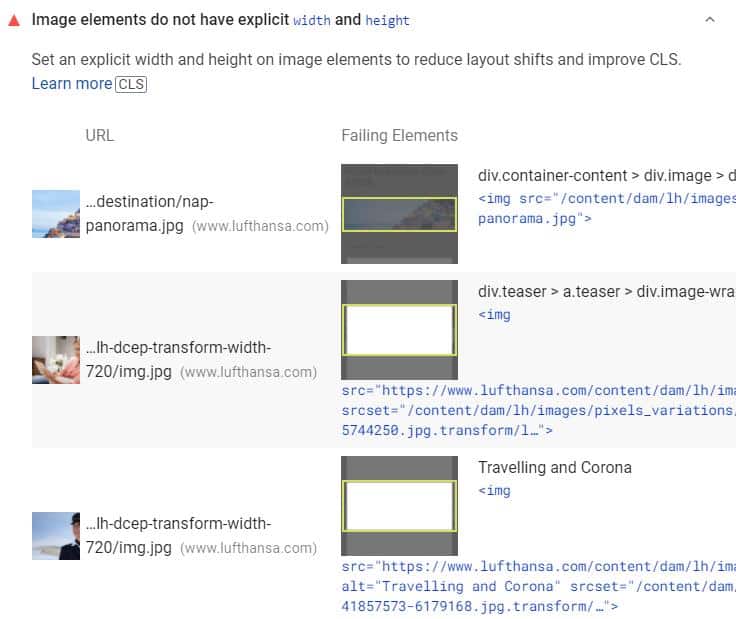
Both Lighthouse and PageSpeed Insights can tell you which images lack width and height attributes. If this is an issue for your age, you will see it right In the Diagnostics report.
Use min-height for dynamic <h1> tags
It’s common for airlines to use dynamic prices in the <h1> tag, but this usually comes with shifting content within the viewport down.
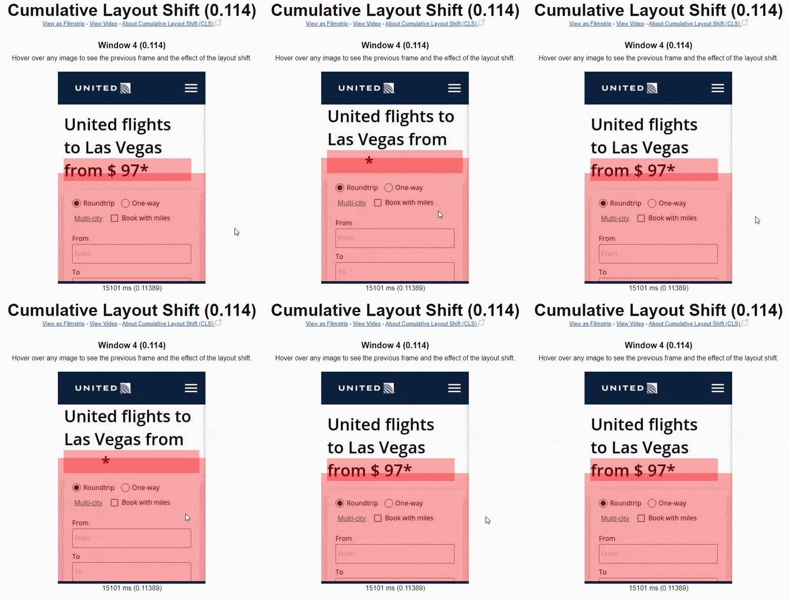
To prevent this shift from happening, set a min-height for the <h1> tag!
Reserve space for ad slots, embeds, and iframes
If your site displays ads, you will have to consider that advertisements are one of the most common causes of layout shifts. This is especially true for ads with dynamic sizes! Fortunately, there are a few best practices to avoid layout shifts from ads:
- Reserve the slot size so there is no layout shift when the ad loads. Choose the largest possible size for the ad slot or the most likely size based on historical data.
- If visible, don’t collapse the reserved space if there is no ad returned.
- Avoid placing ads near the top of the viewport.
Embeddable widgets and iframes can create layout shifts because they are often unaware of their size. To avoid layout disruptions from embeds and iframes, note their dimensions and style a placeholder accordingly.
Don’t insert new content above existing content
Dynamic content such as cookie and GDPR notices, app banners, and pop-ups at the top of the viewport can cause significant layout shifts. Avoid injecting new content above existing content unless it’s in response to user interactions.
User interactions that trigger layout shifts are excluded from CLS scores. But there is a big caveat: layout shifts that result from user interactions must occur within 500 ms of user input. Therefore, make sure that layout shifts happen within 500 ms of user interaction!
If you need to display new content that is not in response to user interaction, reserve enough space for it in advance (e.g., using placeholders or skeleton UI).
For example, with the emergence of the European General Data Protection Regulation (GDPR), cookie consent notices became compulsory for airlines’ websites. You can find them in all shapes and forms: on the header or footer, inline, as a modal, or even as interstitial.
The truth is that cookie notices can bring important issues for CLS, especially if implemented on top of the screen.

To avoid large layout shifts, follow the best practices to optimize cookie notices for performance, especially:
- Avoid top-of-screen cookie notices. Instead, consider a sticky footer or modal to display the cookie banner.
- If sticking to a top-of-screen cookie notice, then reserve space in the DOM for the banner.
- Avoid animations that can trigger layout shifts.
- Prevent FOIT/FOUT from the web fonts.
Another leading cause of layout shifts on flight pages is dynamic fare modules above existing content. Usually, fare modules load after content elements are visible on a page and push them down, sometimes dramatically, as shown below.
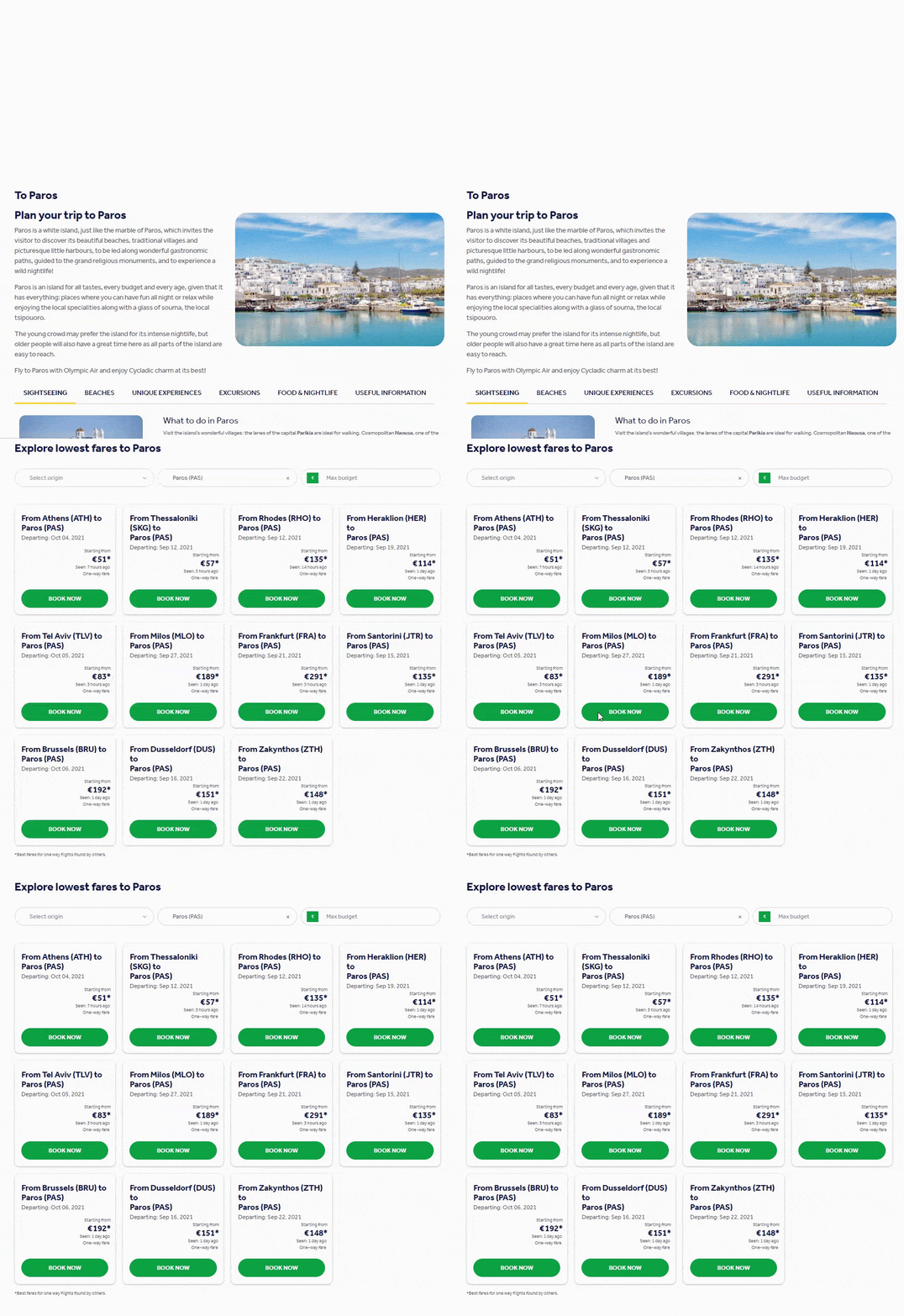
To avoid getting punished by Google (and users!), reserve space for fare modules in advance by using placeholders or skeleton UI.
Avoid FOIT/FOUT from fonts
Web fonts are also a common culprit of unexpected layout shifts. They can shift the layout in two ways:
- Flash of Unstyled Text (FOUT): when the fallback font is swapped with a new font, which results in shifts and flashes.
- Flash of Invisible Text (FOIT): when “invisible” text is displayed because a new font takes a long time to render.
There are several techniques to reduce the font loading impact (none completely satisfactory). Still, the most common recommendations are the use of font-display: optional or font-display: swap, and preloading above-the-fold fonts. Read Google’s guide for more details on using these attributes to avoid layout shifts from web fonts.
An emerging CSS descriptor also reduces layout shifts by matching the fallback and the primary font: size-adjust. The feature is supported in Chrome 92 and Firefox 89. Very promising!
Use efficient CSS animations
Animations can also disrupt the visual stability of a page. That’s because specific CSS property values can trigger re-layouts and re-paints.
Use Lighthouse and PageSpeed Insights to detect animations that trigger layout shifts.
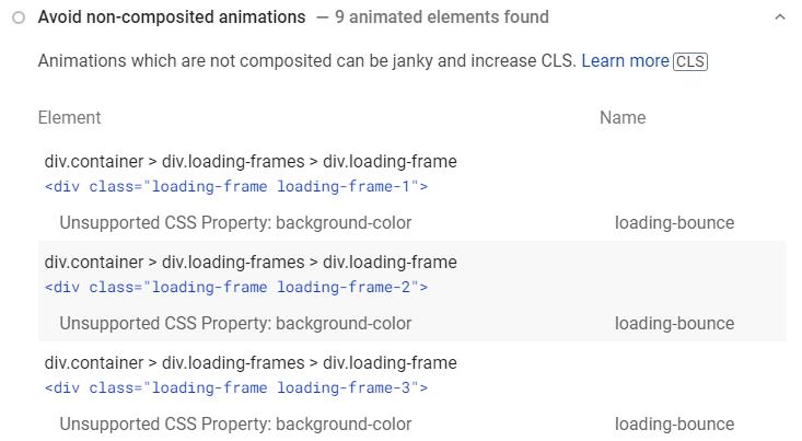
To avoid layout shifts, stick to transform and opacity changes for your animations. To learn more about the CSS properties that cause layout, see CSS Triggers.
