Optimize for Mobile-First Indexing
SEO for Airlines
In 2016, Google announced that it was experimenting with mobile-first indexing, which basically means that Google would look at the mobile version of a site FIRST during the crawling, indexing, and ranking processes. During 2018 and 2019, Google slowly rolled out mobile-first indexing and is expected to include all websites by September 2020.
As the web becomes more mobile-friendly, airlines need to make sure that their websites offer the best user experience and provide Google with consistent information from the desktop and mobile versions of the site.
In this section:
2. Adhere to mobile URL implementation requirements >
3. Provide consistent experience on the desktop and mobile site >
1. Be mobile-friendly
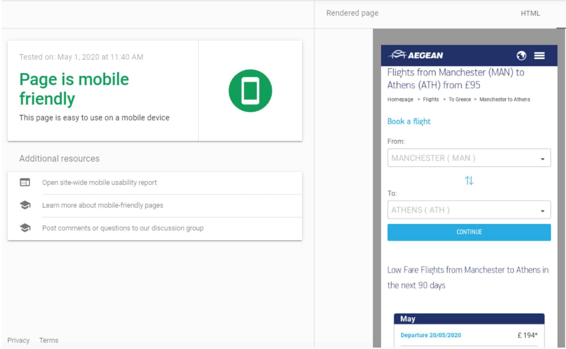
First and foremost: be mobile-friendly. It seems redundant, but it’s important to stress it.
There are three methods to make a website mobile-friendly:
We always advise our customers to build a responsive website, which is the safest and more efficient method. We strongly recommend against using separate websites for each website version.
Looks like the mobile URL isn't being picked up as belonging to the desktop URL. That can sometimes happen, and is one of the reasons we don't recommend separate mobile URLs anymore. Separate URLs for the same content makes things unnecessarily harder.
— 🍌 John 🍌 (@JohnMu) June 20, 2019
To comply with the best practices for SEO and user experience, the pages in airTRFX are fully responsive for all devices and browsers.

2. If using separate URLs for mobile, adhere to the implementation requirements
If for a good reason (and it better be very good) you still need to use separate URLs for the mobile site (e.g.: https://m.airline.com), then make sure that you adhere to the best SEO practices for separate Mobile URLs:
1. Signal the relationship between the desktop and mobile URLs by using the link tag with rel=”canonical” and rel=”alternate” elements.
On the desktop page, add a rel=”alternate” tag pointing to the corresponding mobile URL. On the mobile page, add a rel=”canonical” tag pointing to the corresponding desktop URL.
There are two methods to implement this annotation: in the HTML and in XML sitemap. For example, let’s say the desktop version of a page is https://airline.com/en-us/flights-to-chicago while the mobile version is https://m.airline.com/en-us/flights-to-chicago.
The annotation in the HTML of the desktop page would look like this:
<link rel=”alternate” media=”only screen and (max-width: 640px)”
href=”https://m.airline.com/en-us/flights-to-chicago”>
On the mobile page, the HTML annotation would be:
<link rel=”canonical” href=”https://airline.com/en-us/flights-to-chicago”>
The annotation in the XML sitemap should be:
<url>
<loc>https://airline.com/en-us/flights-to-chicago</loc>
<xhtml:link rel=”alternate” media=”only screen and (max-width: 640px)”
href=”https://m.airline.com/en-us/flights-to-chicago” />
</url>
</urlset>
2. Use a canonical tag on the mobile URL pointing to the desktop URL.
For example, on https://m.airline.com/en-us/flights-to-chicago, the canonical tag annotation should be:
<link rel=”canonical” href=”https://airline.com/en-us/flights-to-chicago” />
3. Detect user-agent strings and redirect them correctly.
You can redirect users to the best URL (preferably a 302 redirect), based on the device they are using. Remember to treat Googlebot like any other user-agent.
Googlebot supports HTTP (including the Vary HTTP Header) and JavaScript redirects. Regardless of the method you use, the redirect must be consistent with the rel=”alternate” link tag.
4. Allow users to switch between the desktop or mobile URL.
This will allow users to override the redirect policy in case it’s faulty and choose the URL version they want to see.
5. If using hreflang, link between desktop and mobile URLs separately.
Hreflang links on the desktop URL should point to the localized desktop URLs. Similarly, hreflang links on the mobile URL should point to the localized mobile URLs.
For example:
On https://airline.com/en-us/flights-to-chicago, the hreflang annotation should be:
<link rel=”canonical” href=”https://airline.com/en-us/flights-to-chicago”>
<link rel=”alternate” media=”only screen and (max-width: 640px)” href=”https://m.airline.com/en-us/flights-to-chicago”>
<link rel=”alternate” hreflang=”es-es” href=”https://airline.com/es-es/flights-to-chicago”>
<link rel=”alternate” hreflang=”fr-fr” href=”https://airline.com/fr-fr/flights-to-chicago”>
<link rel=”alternate” hreflang=”de-de” href=”https://airline.com/de-de/flights-to-chicago”>
On the mobile version, https://m.airline.com/en-us/flights-to-chicago, it would be:
<link rel=”canonical” href=”https://airline.com/en-us/flights-to-chicago”>
<link rel=”alternate” hreflang=”es-es” href=”https://m.airline.com/es-es/flights-to-chicago”>
<link rel=”alternate” hreflang=”fr-fr” href=”https://m.airline.com/fr-fr/flights-to-chicago”>
<link rel=”alternate” hreflang=”de-de” href=”https://m.airline.com/de-de/flights-to-chicago”>
6. Avoid cross-links.
Make all internal links on the desktop website point to desktop URLs. The same on the mobile website.
7. Use the same robots.txt directives on both versions of the site.
In most cases, you should instruct search engines to crawl the same parts of both versions of the website.
8. Create an XML sitemap for the mobile site.
Same as with the robots.txt file, there should be an XML sitemap for both versions of the site. Also, submit both XML sitemaps to their respective Google Search Console properties.
9. Verify both versions of the site in Google Search Console.
For traffic and ranking analysis, reporting, or troubleshooting, you will want to have access to search and indexation data of both versions of the site.
3. Provide consistent experience on the desktop and mobile site
Finally, regardless of whether the website uses responsive design, dynamic serving, or separate URLs, there are some best practices in the Mobile-First Indexing era:
- Use the same metadata, meta robots tags, and OpenGraph tags on the desktop and mobile sites.
- Use the same content on the desktop and mobile sites, including headings.
- Use the same interlinking structure on the desktop and mobile sites.
- Make sure that the mobile and desktop sites have the same structured data.
- Use the same images and alt text for images on the mobile and desktop site. Make sure that videos are playable on mobile devices.
- Make sure that both the desktop and mobile pages return the same status code.
- Let Google crawl JavaScript, CSS, and image files required for the site to be mobile-friendly.
- Avoid interstitials that block users from completing tasks.
